Popzaar is a curated fashion e-commerce marketplace that champions Indian homegrown brands. In a world dominated by fast fashion giants like Zara and H&M, Popzaar offers an alternative - one that brings craftsmanship, character, and culture to the forefront. The platform is designed to elevate visibility for emerging Indian fashion labels while offering customers a thoughtfully curated and diverse selection. Every brand featured is handpicked by Popzaar’s in-house team of stylists, ensuring that quality, style, and storytelling remain at the heart of the experience.
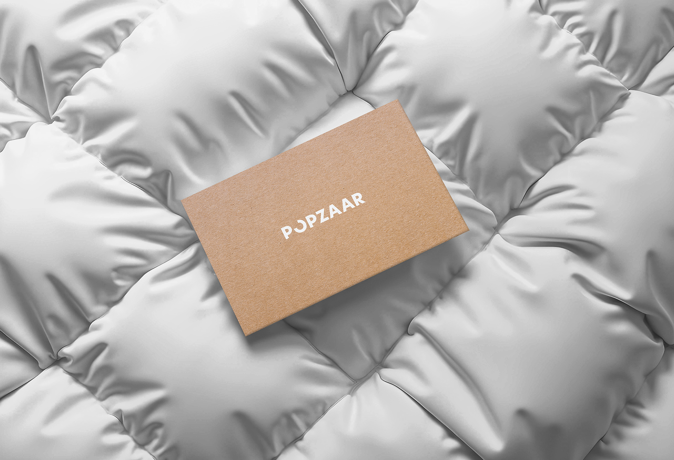
Inspired by the tagline, the Popzaar logo draws from the imagery of a pinhole - symbolising sharp focus, intention, and discovery. It visually represents the platform’s core promise: to bring clarity and attention to what truly matters in fashion. Much like Thursday itself, we thrive in the sweet spot between structure and spontaneity, where wild ideas make love to meticulous execution.
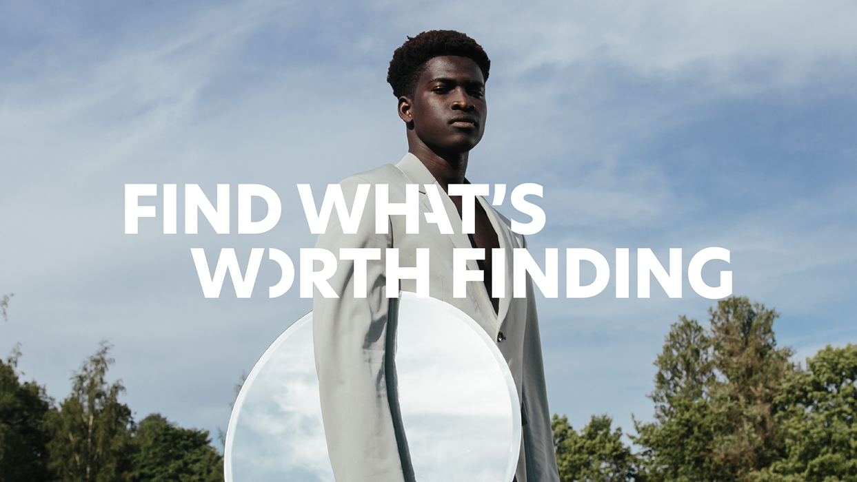
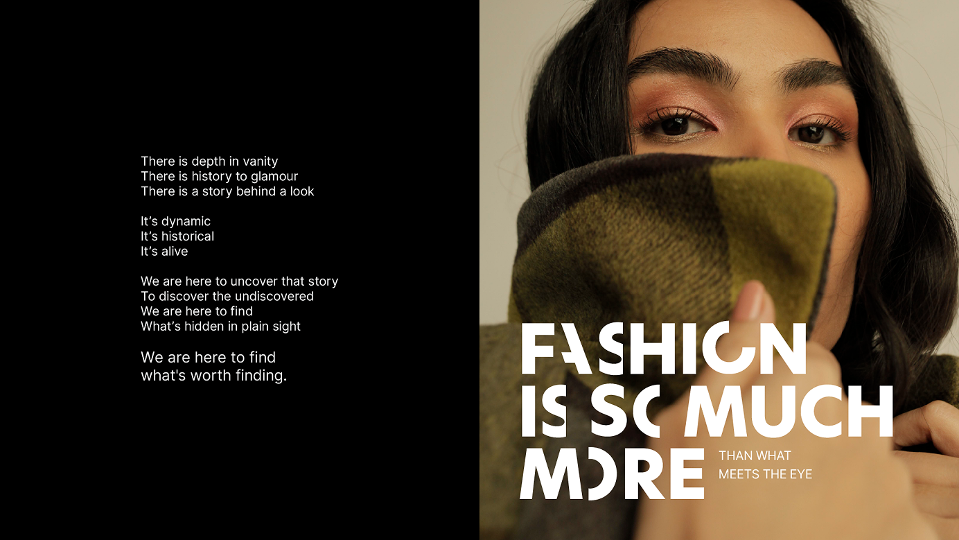
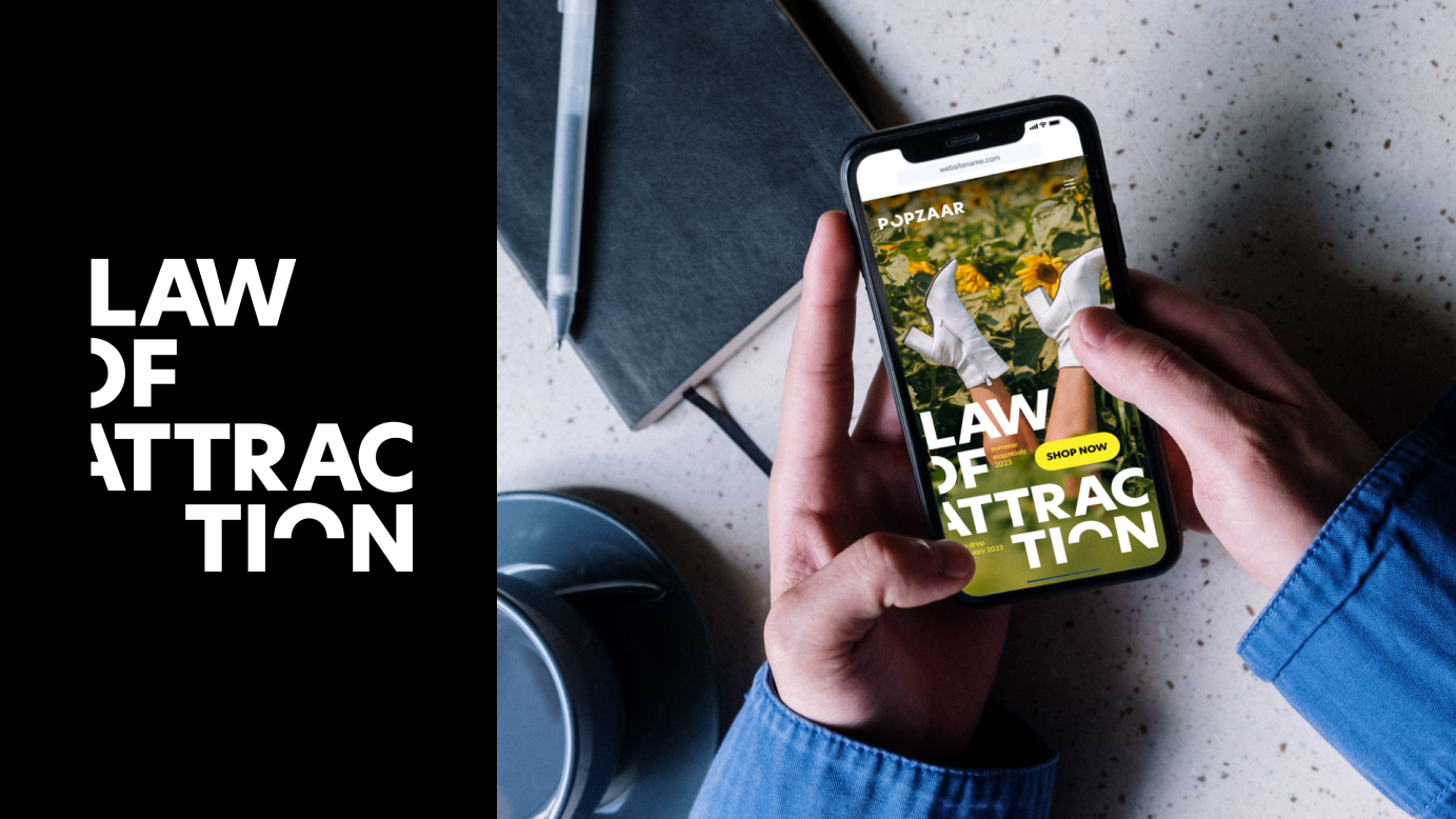
The tagline ‘Find what’s finding for’ comes from the idea that curation is at the heart of Popzaar. Every selection on the platform is intentional, helping people spend less time sifting through noise and more time finding what genuinely fits their taste.
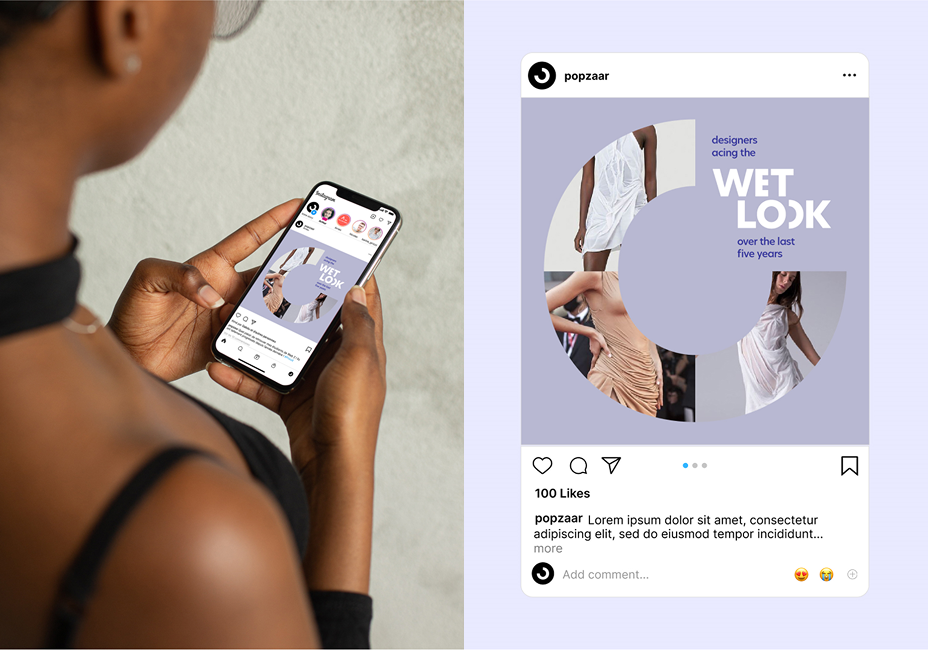
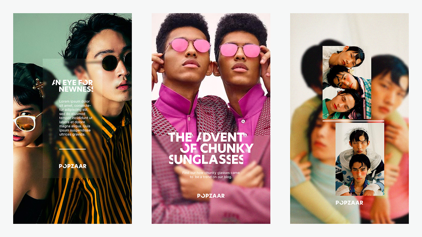
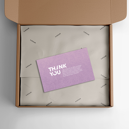
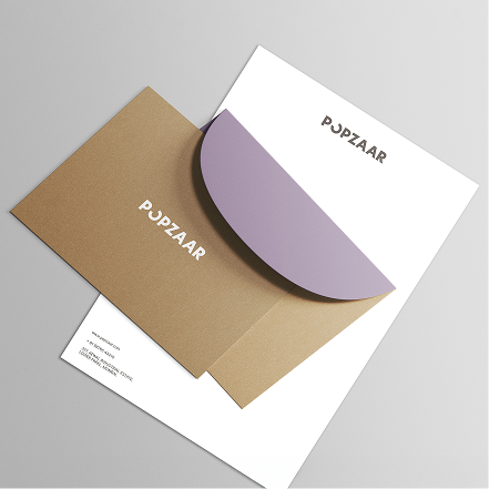
The identity extends the language of the pinhole across the visual system. Circular forms echoing the logo are used to frame images, highlight content, and draw the eye. This repetition of rounded elements becomes a motif for discovery, movement, and curated clarity throughout the brand’s digital and print presence.
The colour palette was chosen for its balance of youthfulness and sophistication. The tones work well together visually, creating a fresh yet refined look that feels modern without being loud.
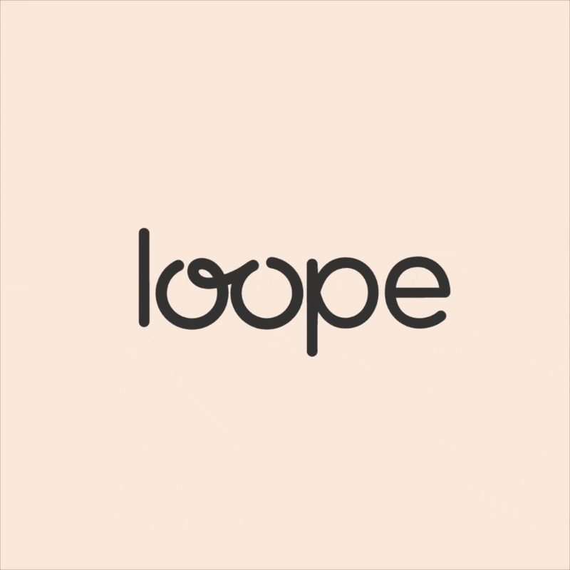
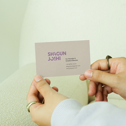
A custom Popzaar typeface was designed inspired from the ‘O’ of Popzaar.
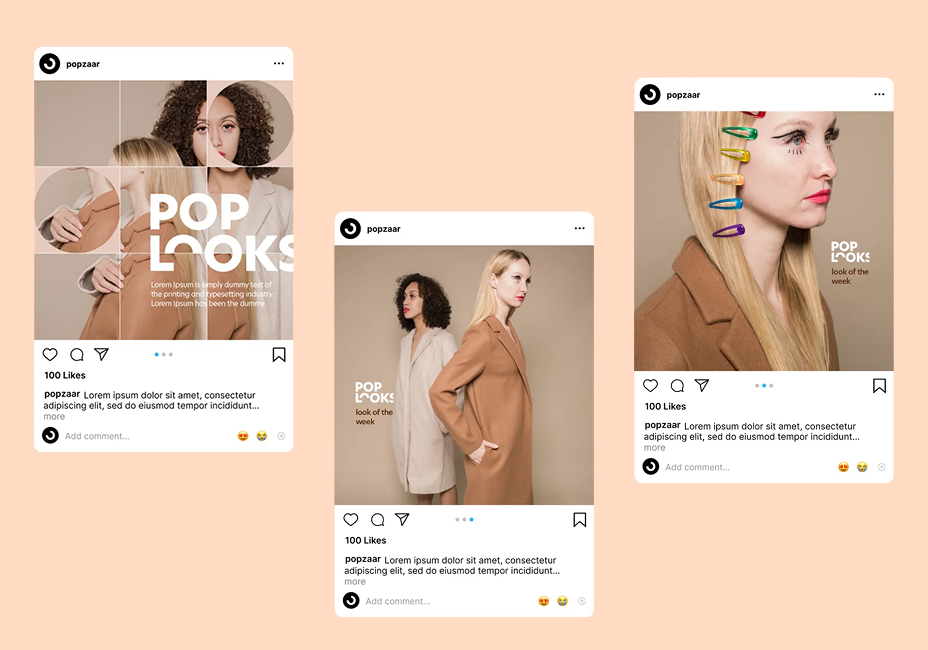
We built templates for each social media bucket, using them to push the design language across content in fresh, consistent ways.