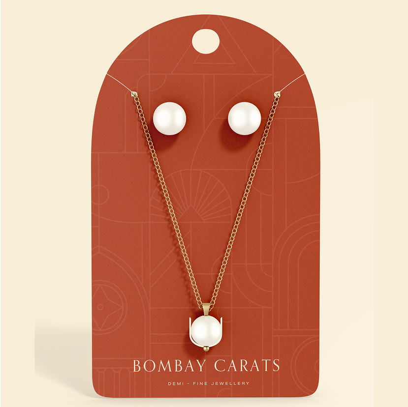
In today’s fast-paced world, the best investment one can make is in themselves. This belief led client to create Bombay Carats - a demi-fine jewellery brand that promotes financial independence for women. Traditionally, jewellery has been gifted to women by their parents or partners, but client wanted to change that narrative. Bombay Carats sits between fine and artificial jewellery, using real gold with cubic zirconia diamonds, making it an accessible yet valuable choice for modern women.
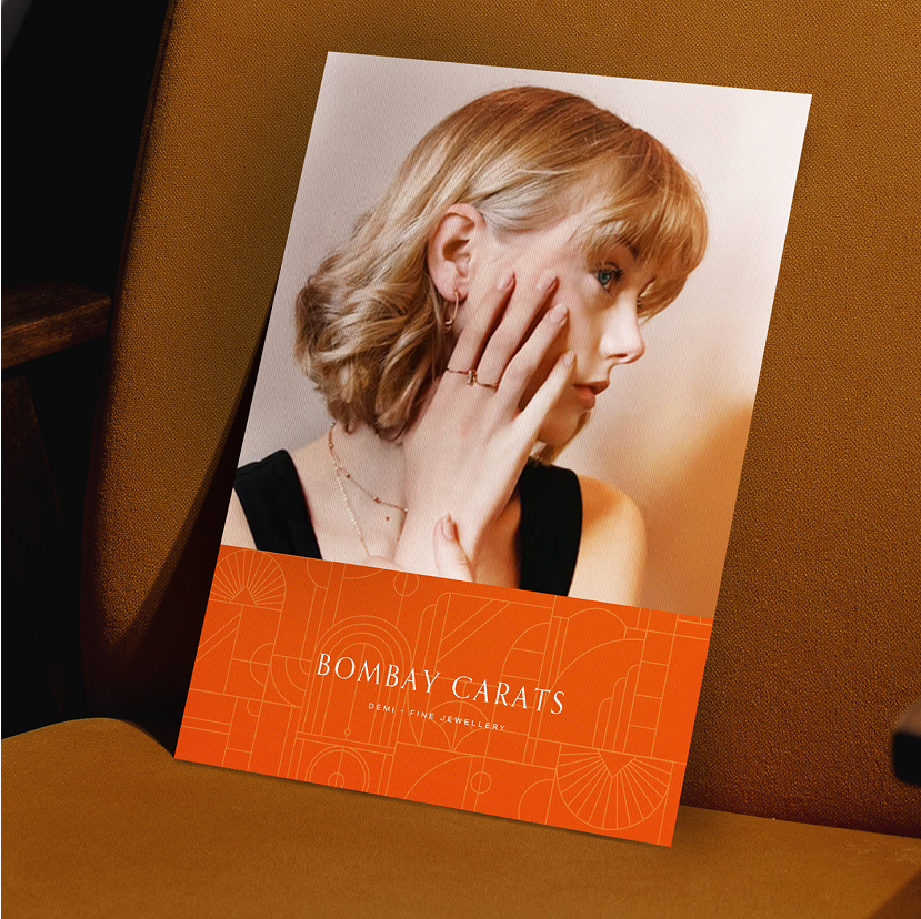
Inspired by Mumbai’s fast pace and timeless charm, Bombay Carats’ identity reflects the city’s blend of movement and elegance. Taking cues from Old Bombay’s Art Deco heritage, we created a design language that is both decorative and sophisticated—rapid yet graceful.
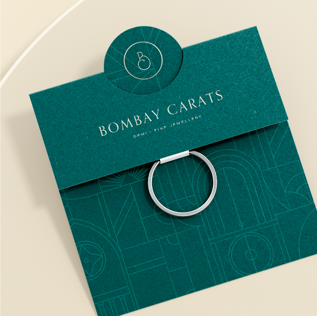
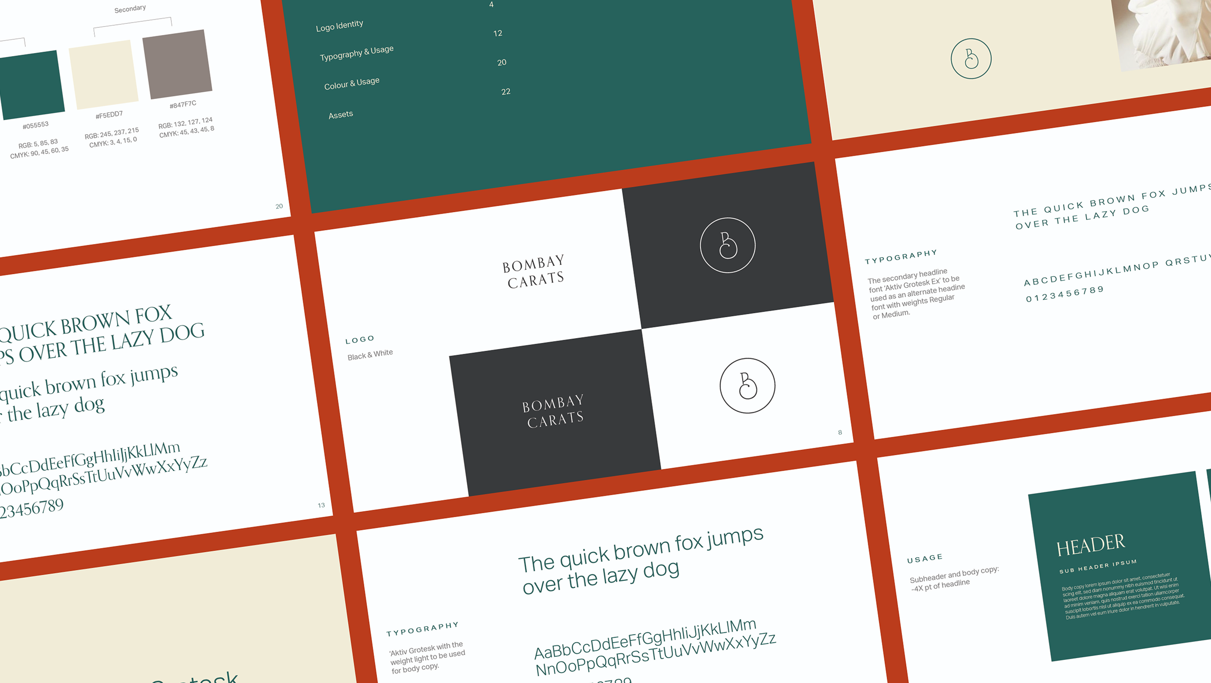
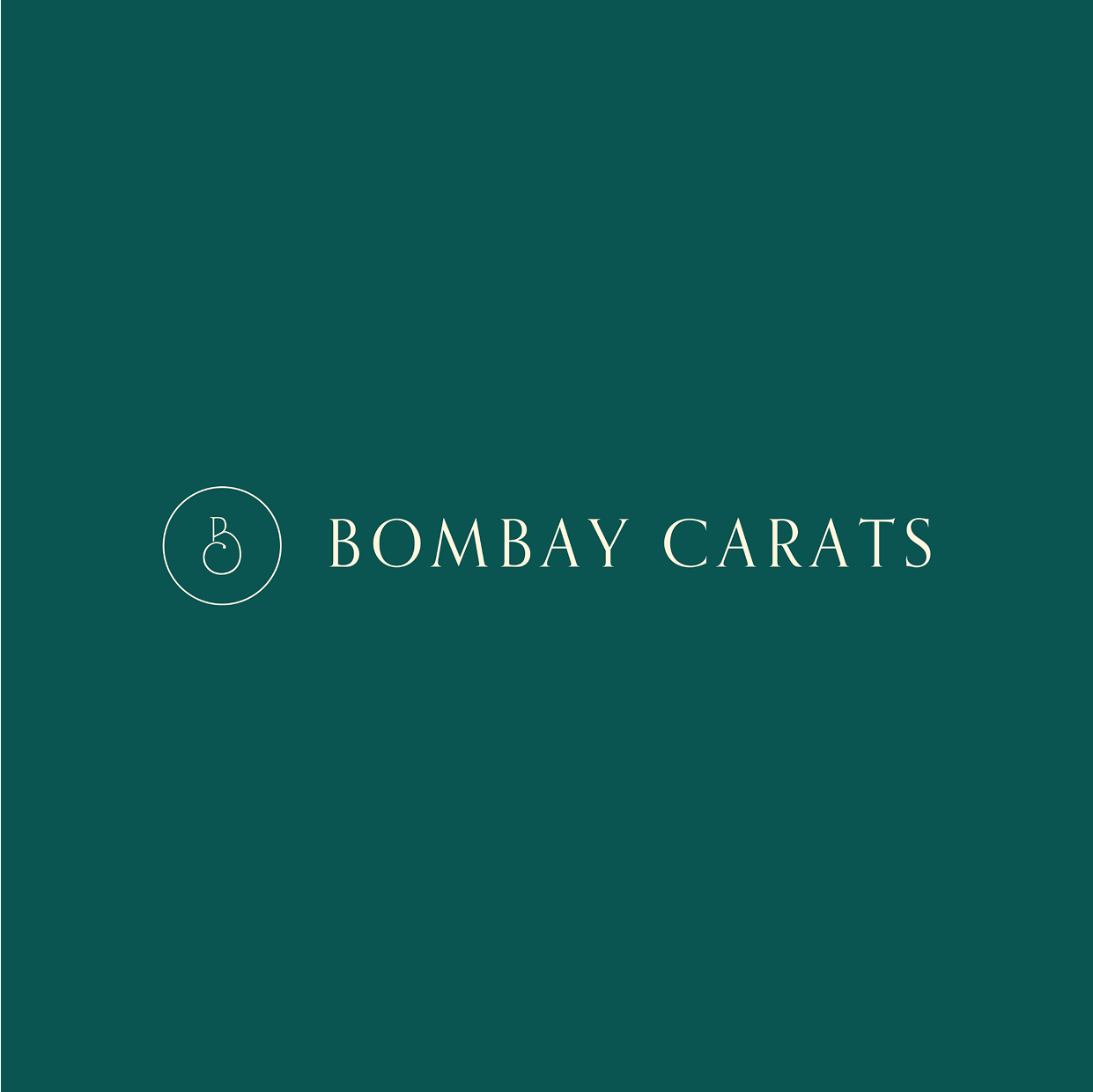
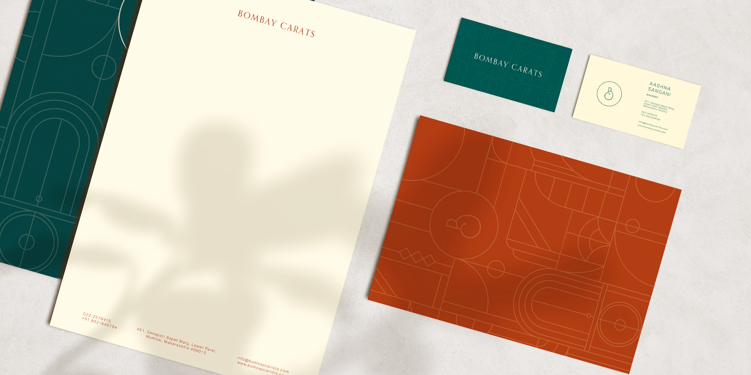
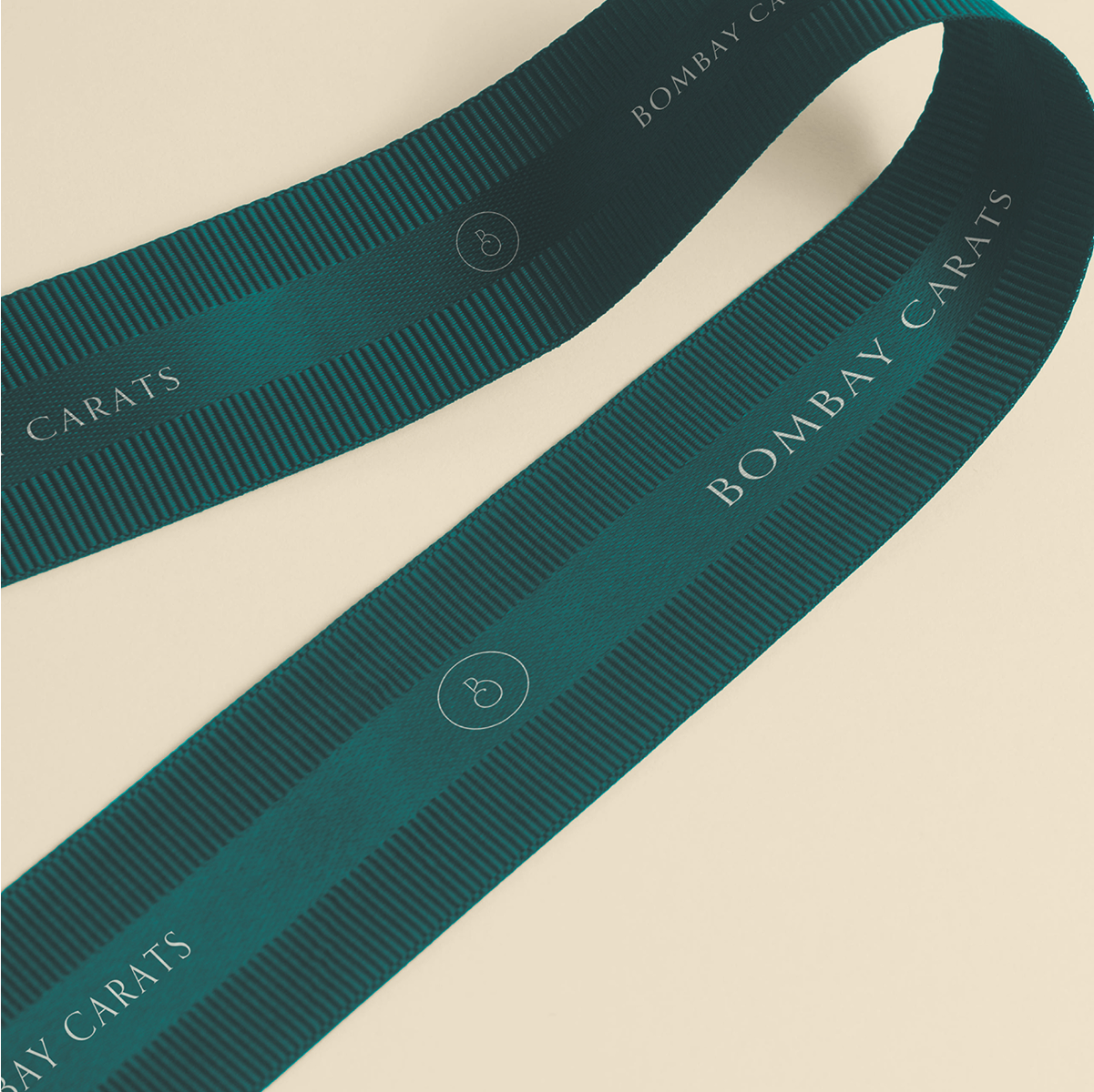
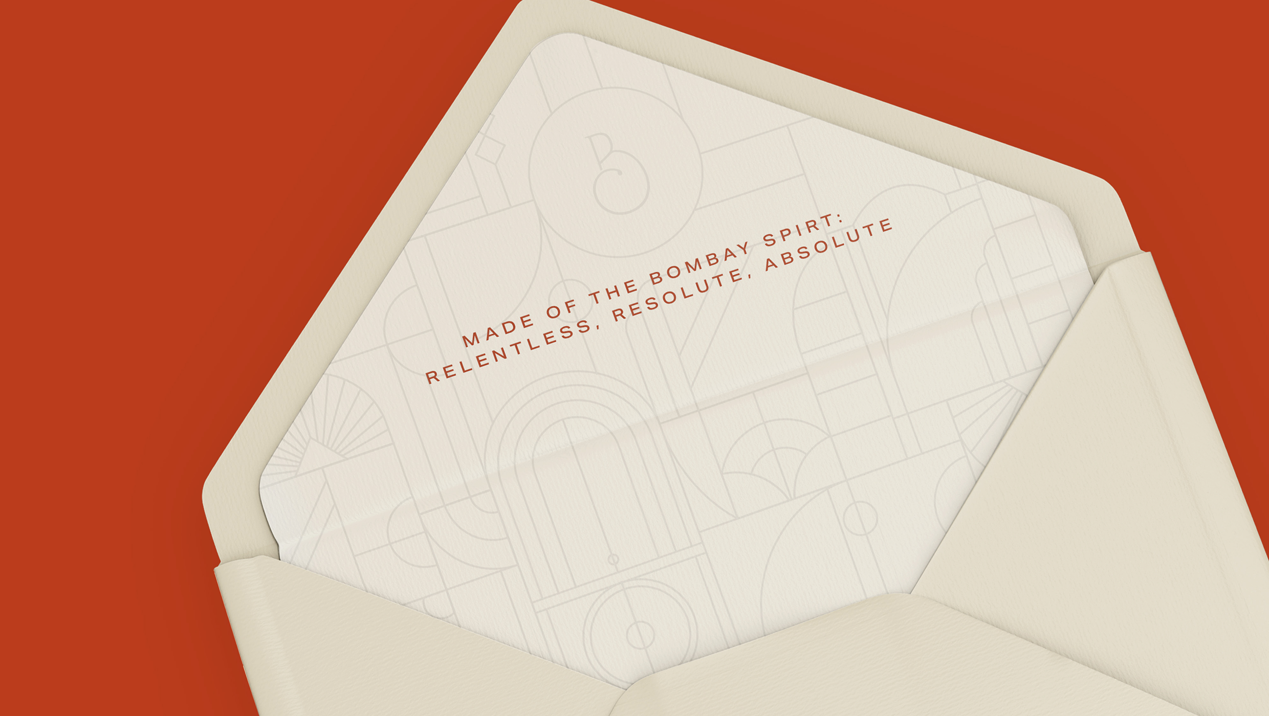
The B monogram is inspired by Bombay’s Art Deco style, with a teardrop detail at the end of the curve.
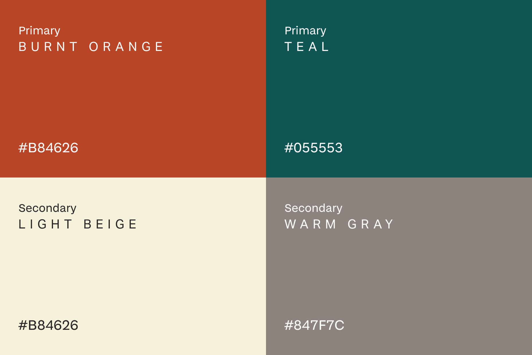
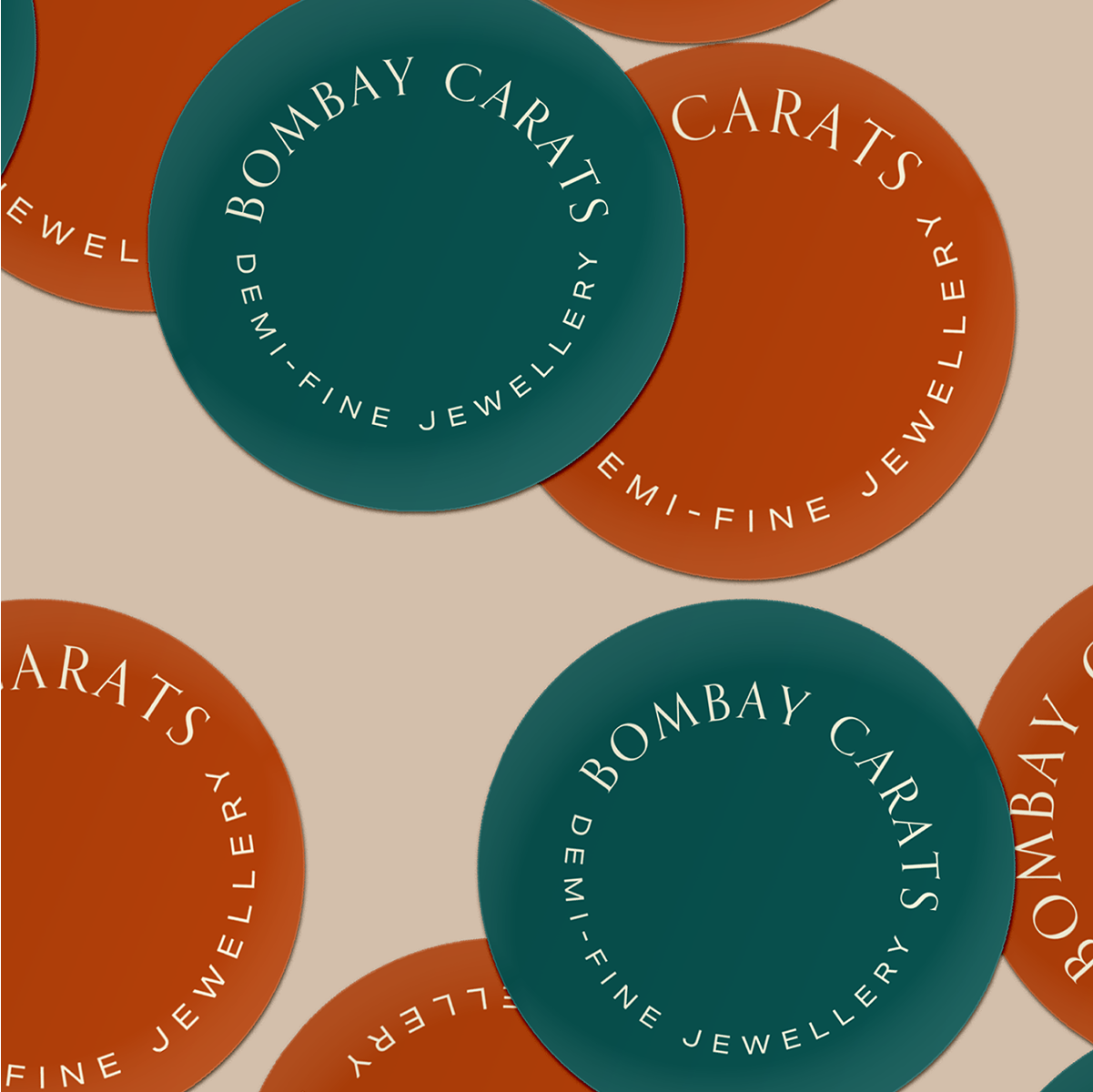
The palette takes cues from the contrast between the city’s sea and skyline - warm, and elegant.
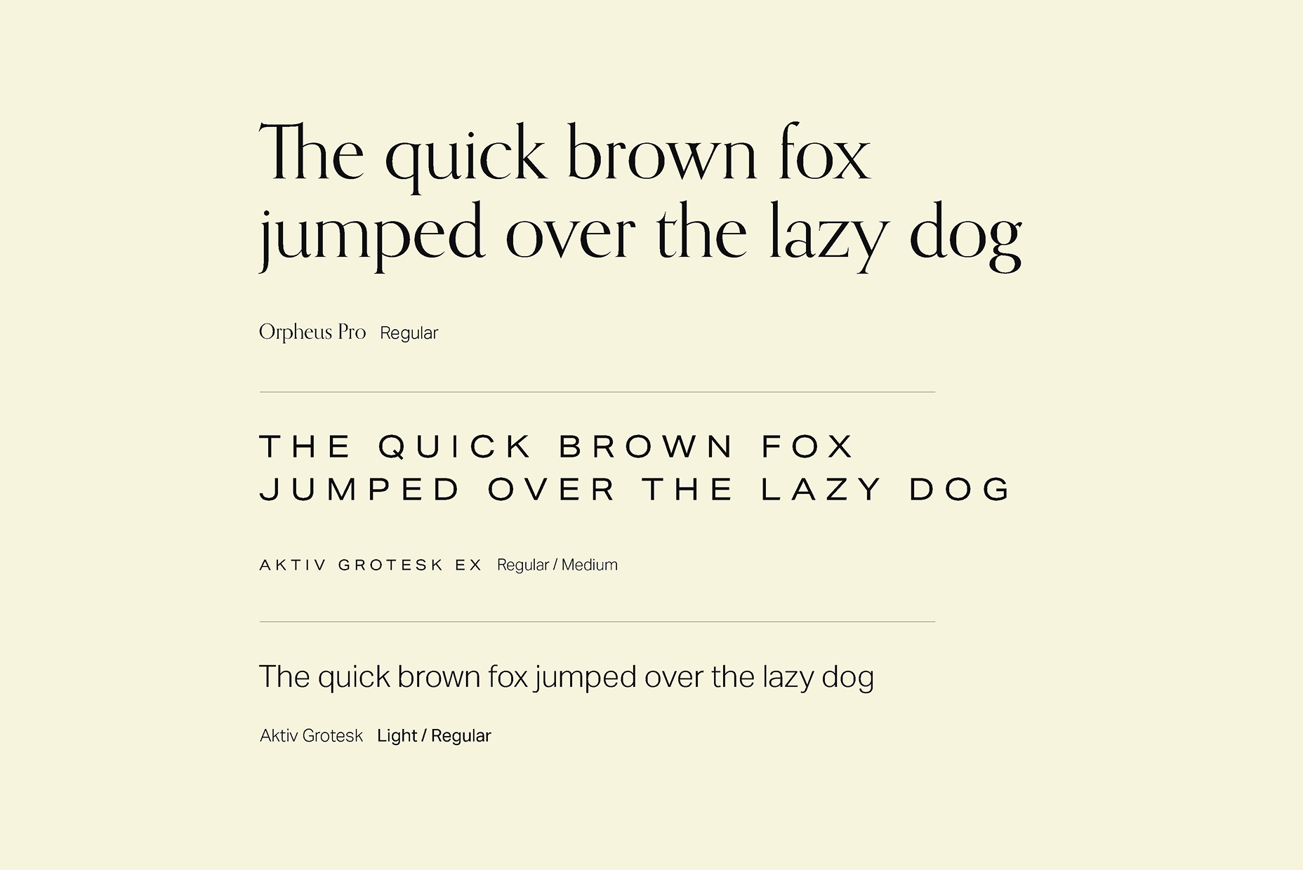
The brand uses Orpheus Pro, a high contrast shortt serif, paired with Aktiv Grotesk, a wide sans serif - balancing classic and modern.
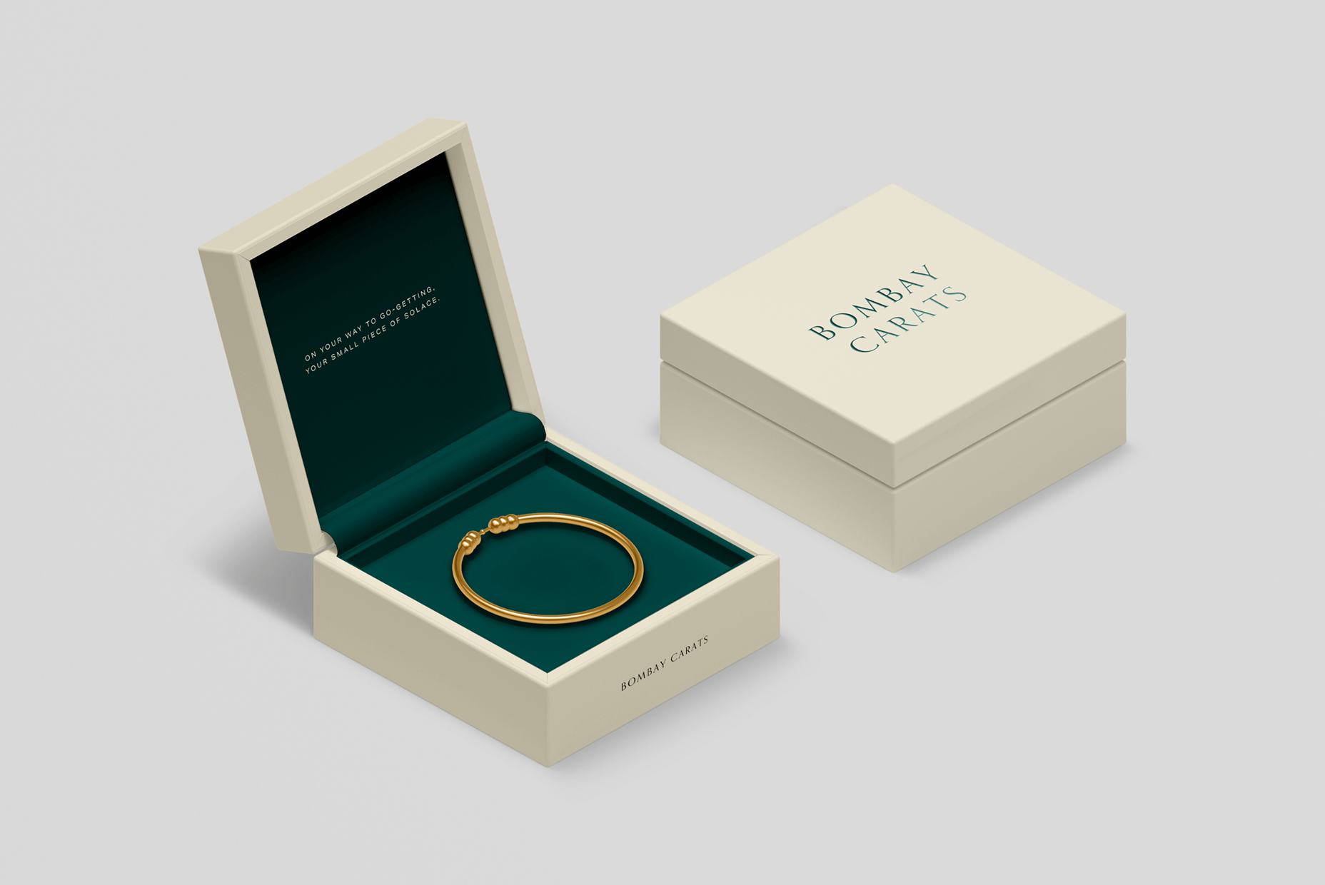
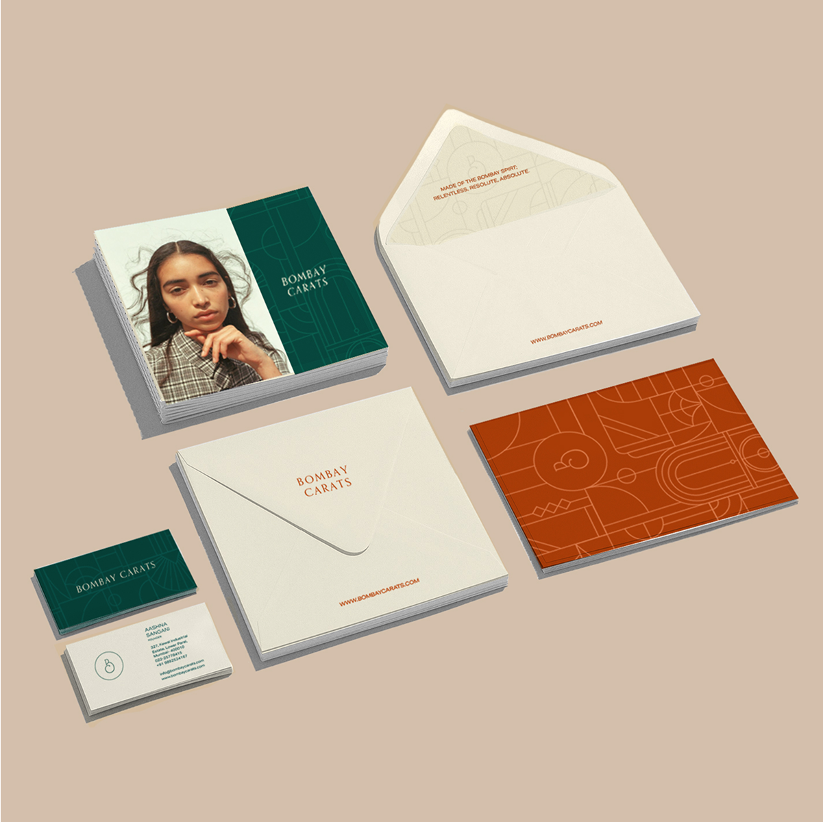
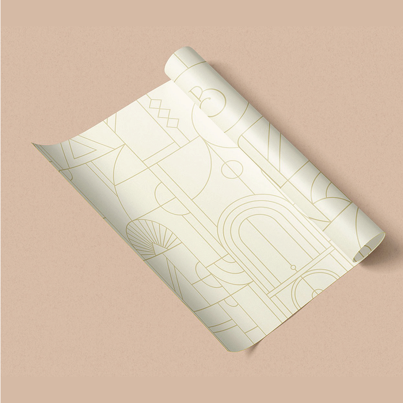
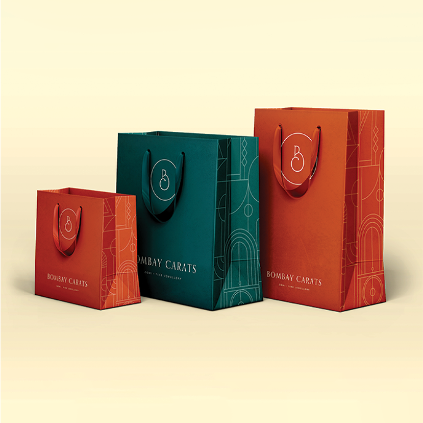
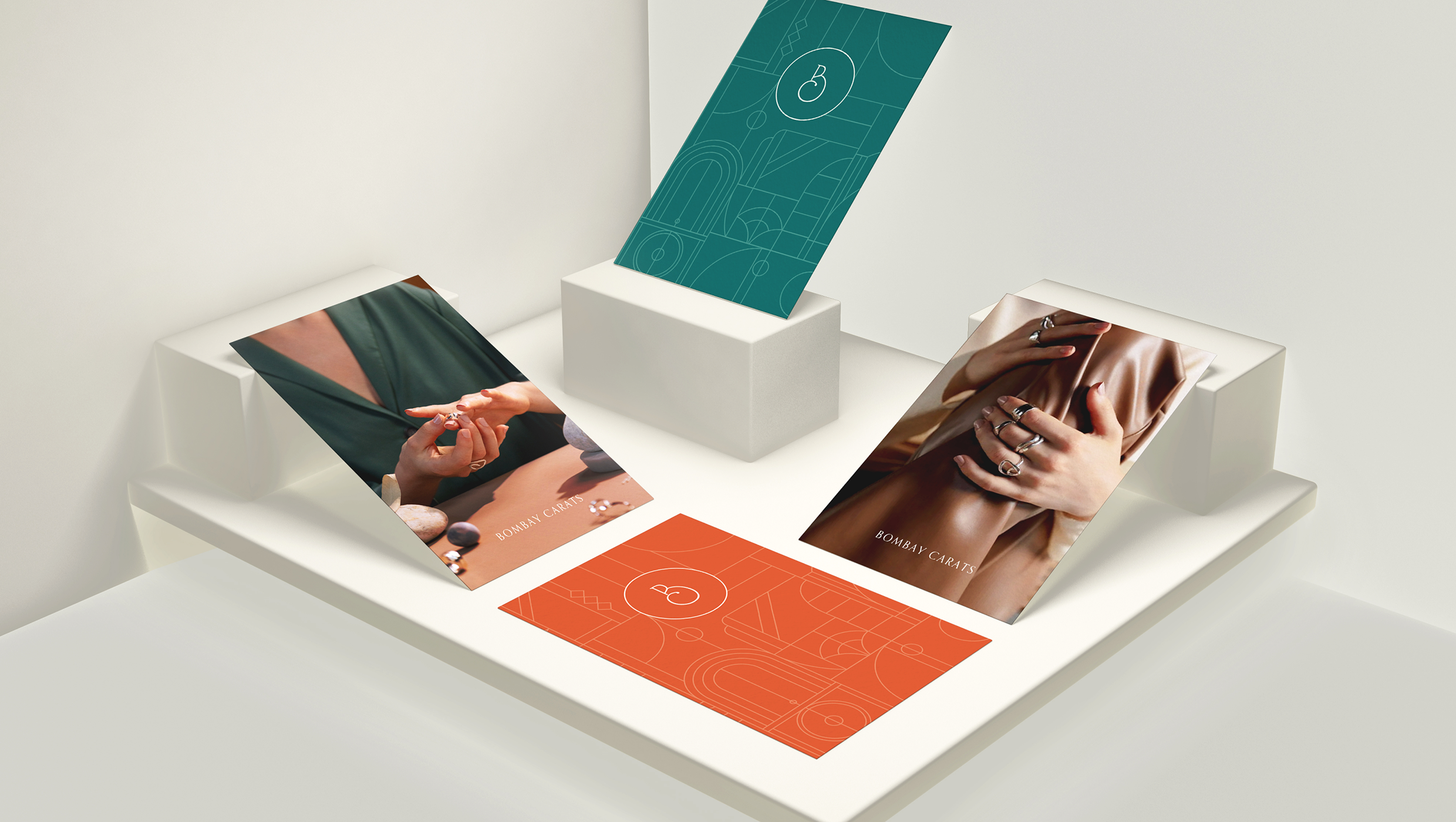
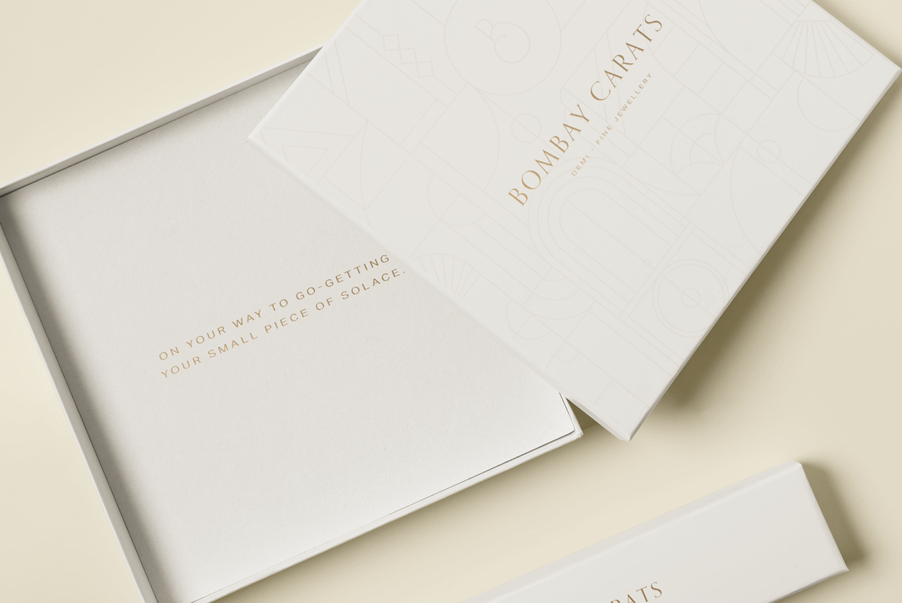
Stationery and packaging use a mix of the monogram and wordmark, along with a subtle background pattern built from core brand elements.

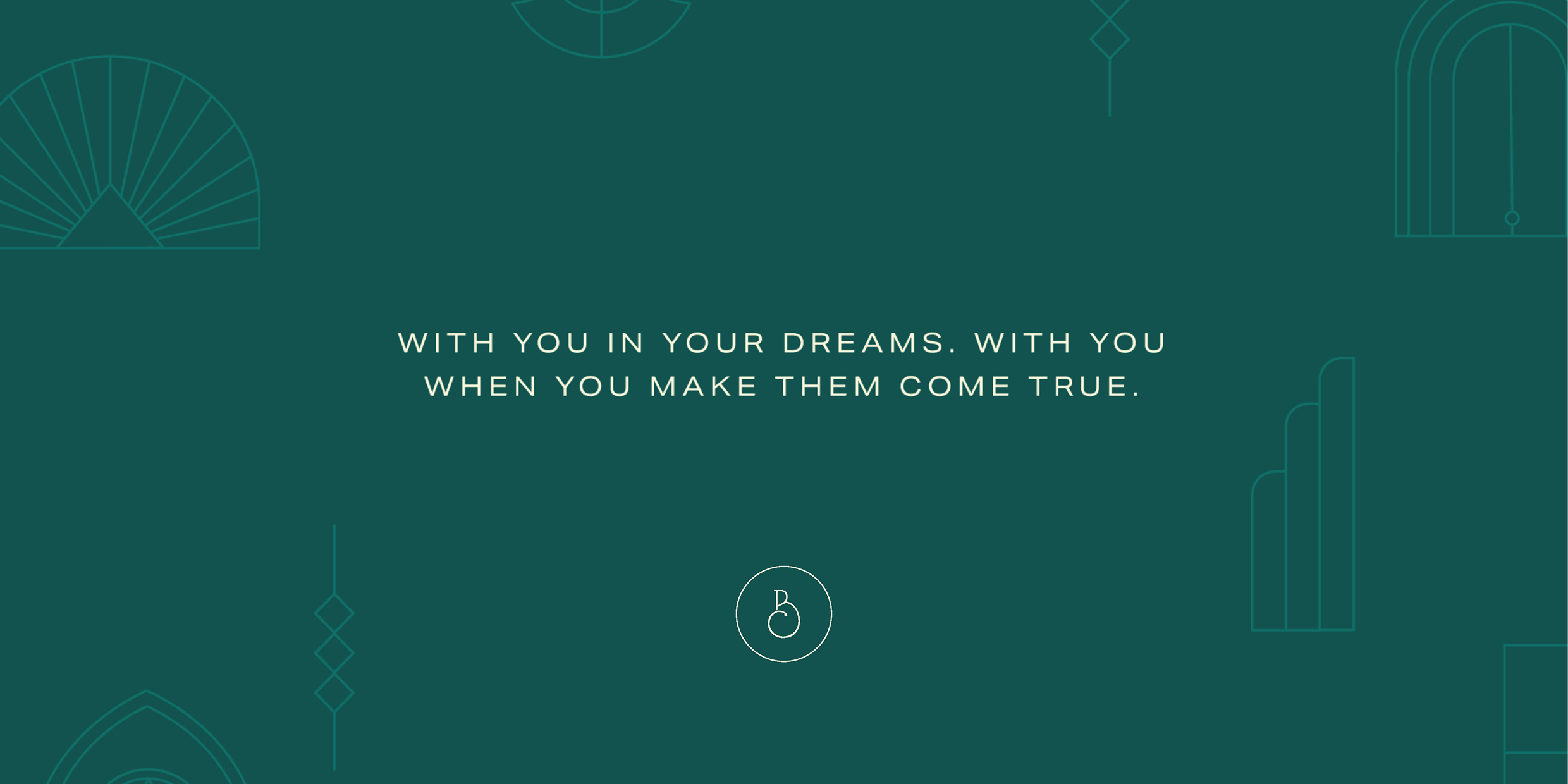
The brand tone is calm, grounded, and reflective of Bombay’s steady, enduring spirit.